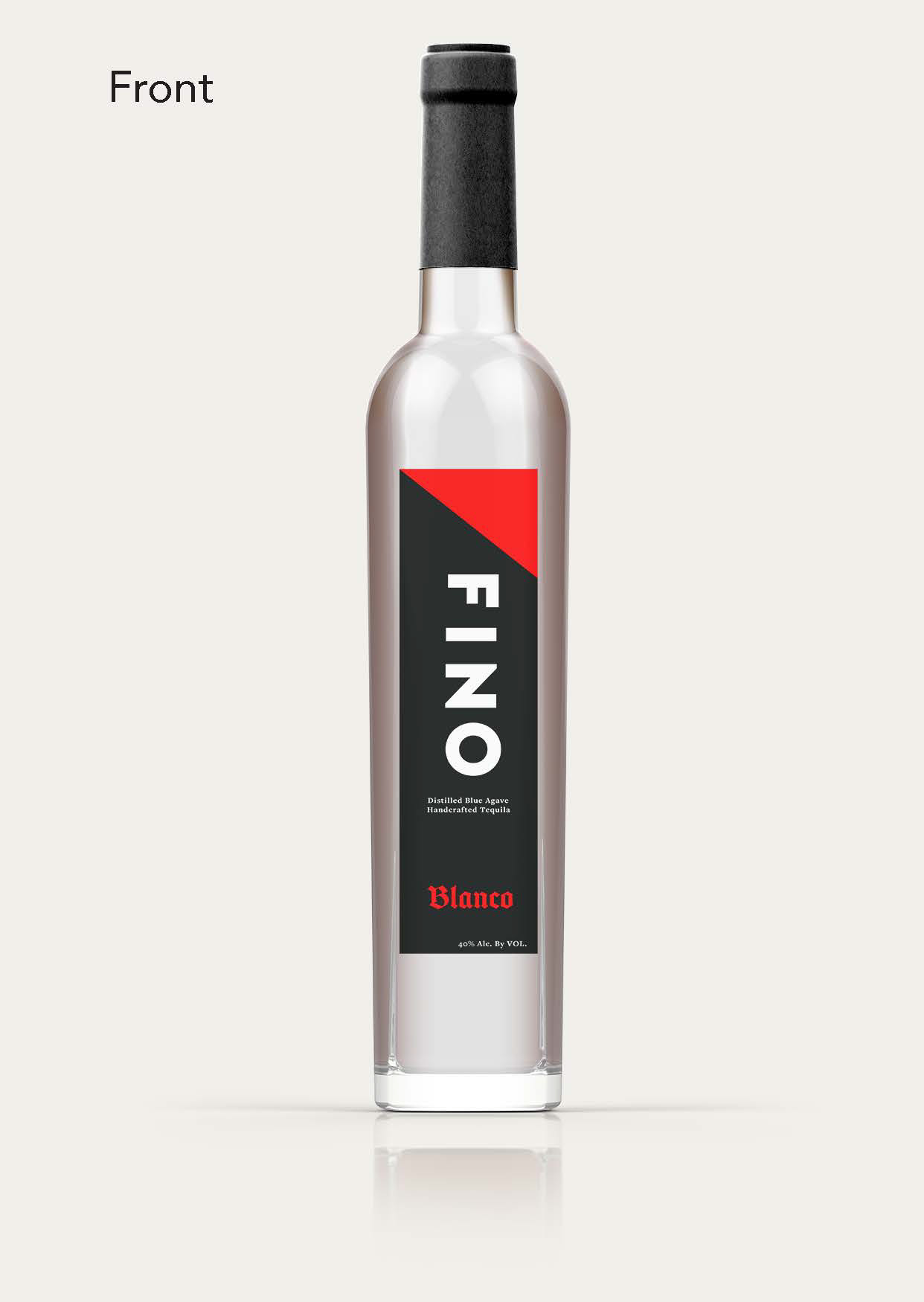
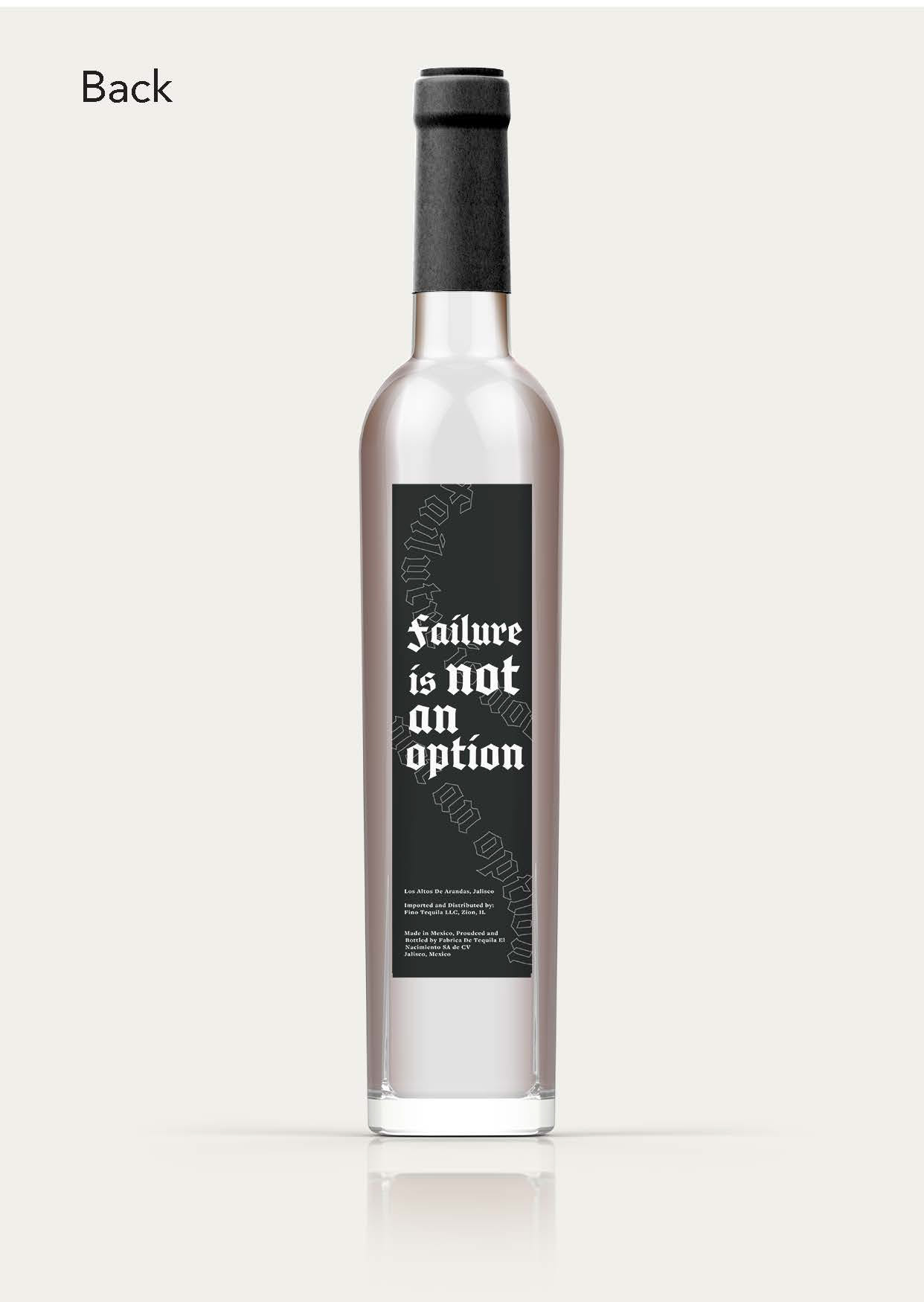
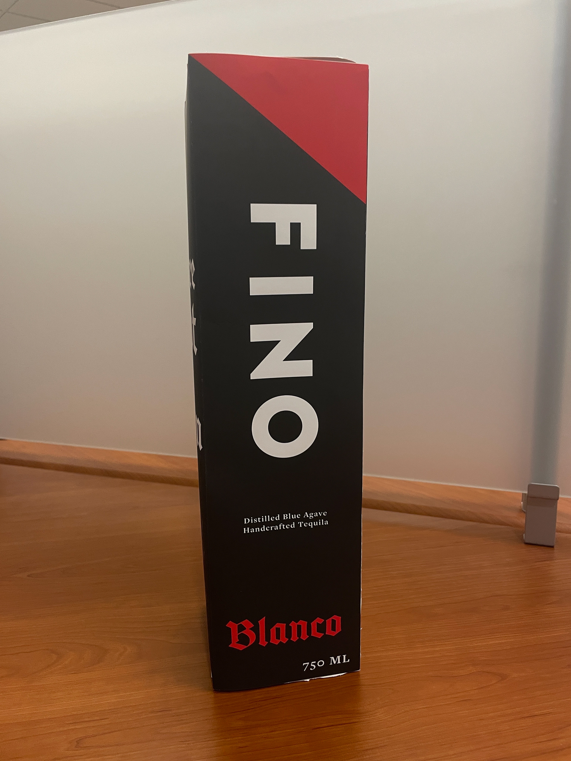
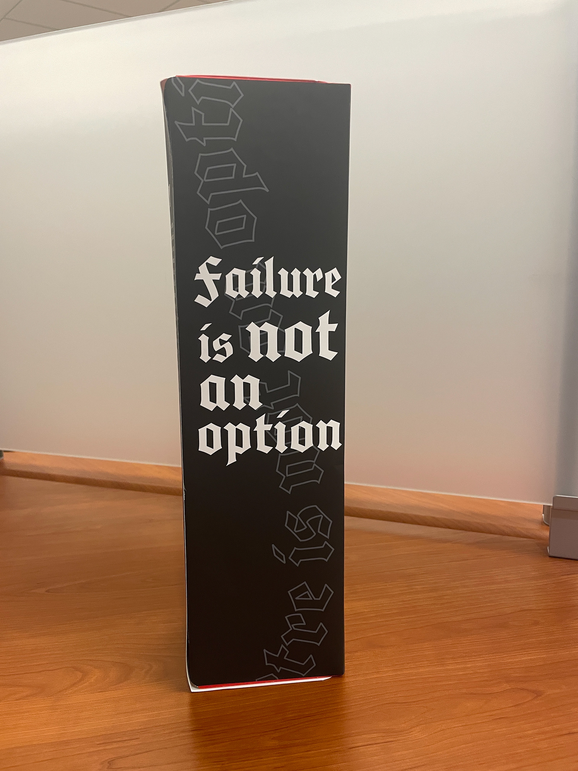
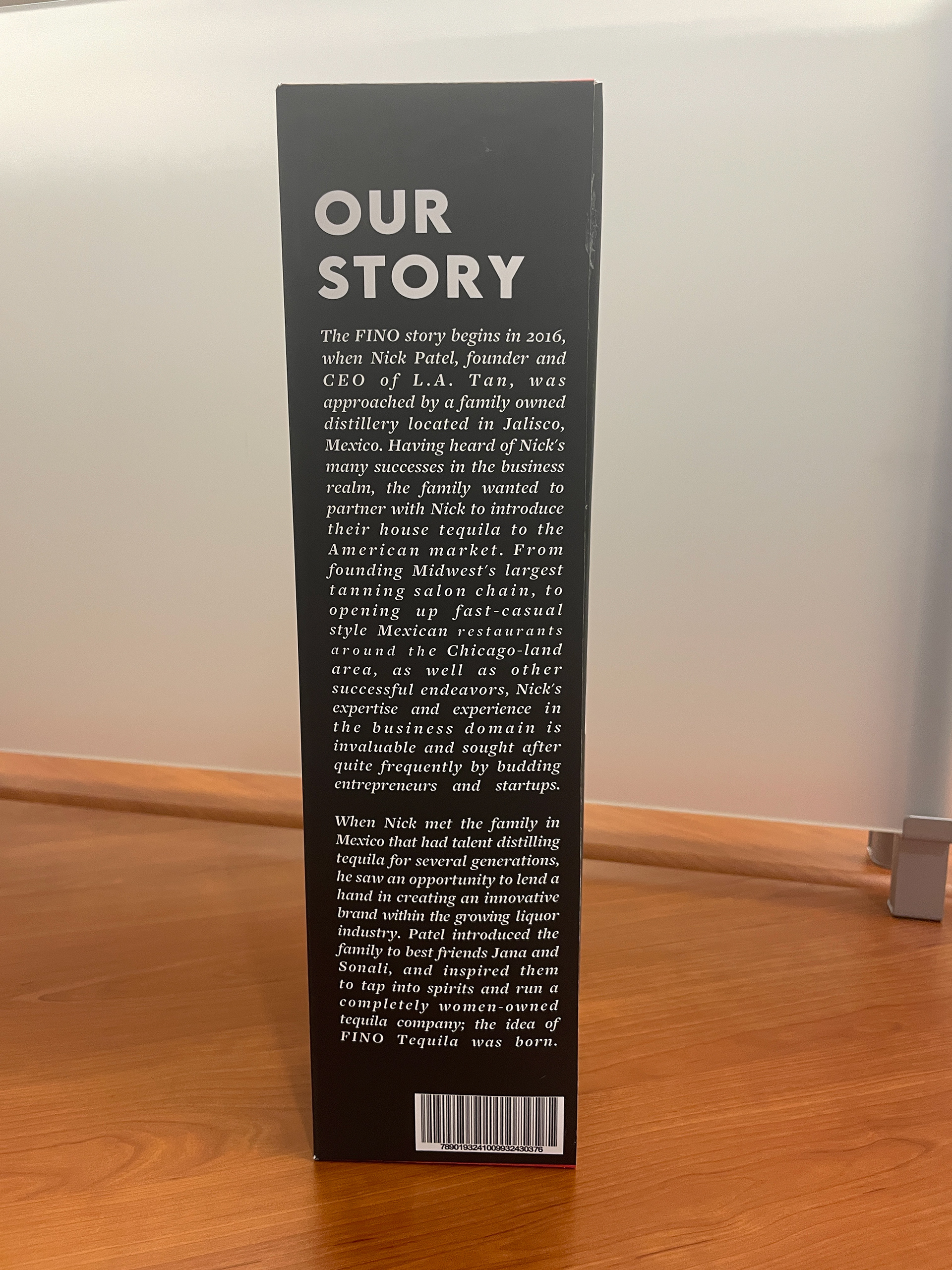
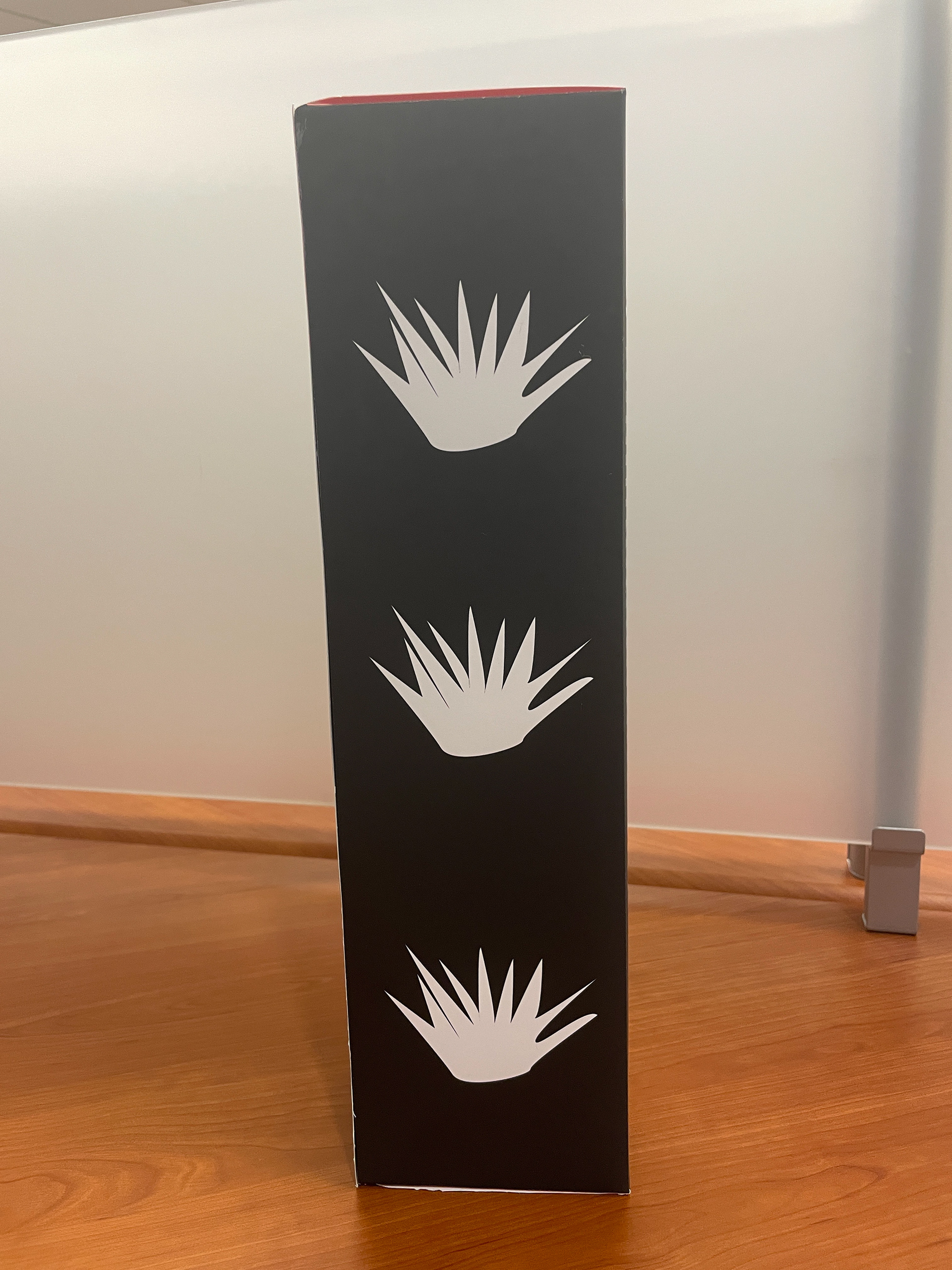
Fino Tequila Packaging Design
Graphic Design, Typography, Layout, Packaging, Branding, Color Theory
Fino Tequila is a women-owned alcohol company based in Chicago, IL. The name "FINO" derives from the Spanish word meaning "fine" or "high quality." The brand’s mission is to inspire and empower both women and men to pursue their dreams, embodying the FINO mindset and lifestyle, with the bold slogan: Failure Is Not an Option.
Approach:
After researching various tequila brands, I chose to focus on Fino Tequila due to its Chicago roots and women-led ownership. For this project, I emphasized their slogan Failure Is Not an Option by incorporating bold typographic elements. I selected the typeface Cabazon, an informal blackletter inspired by a small community on the western edge of California's Mojave Desert, to convey an edgy yet sophisticated aesthetic. My goal was to create packaging that reflects both the brand’s high quality and its empowering, dynamic identity.
