United Rebrand
Branding, Color Theory, Illustration
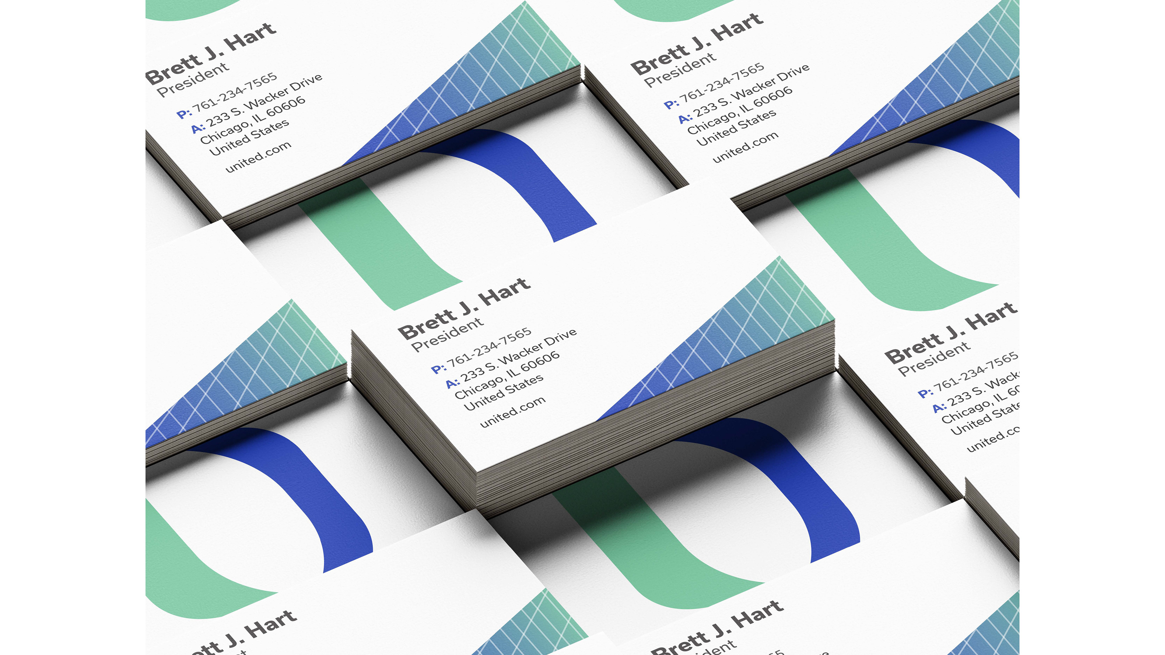
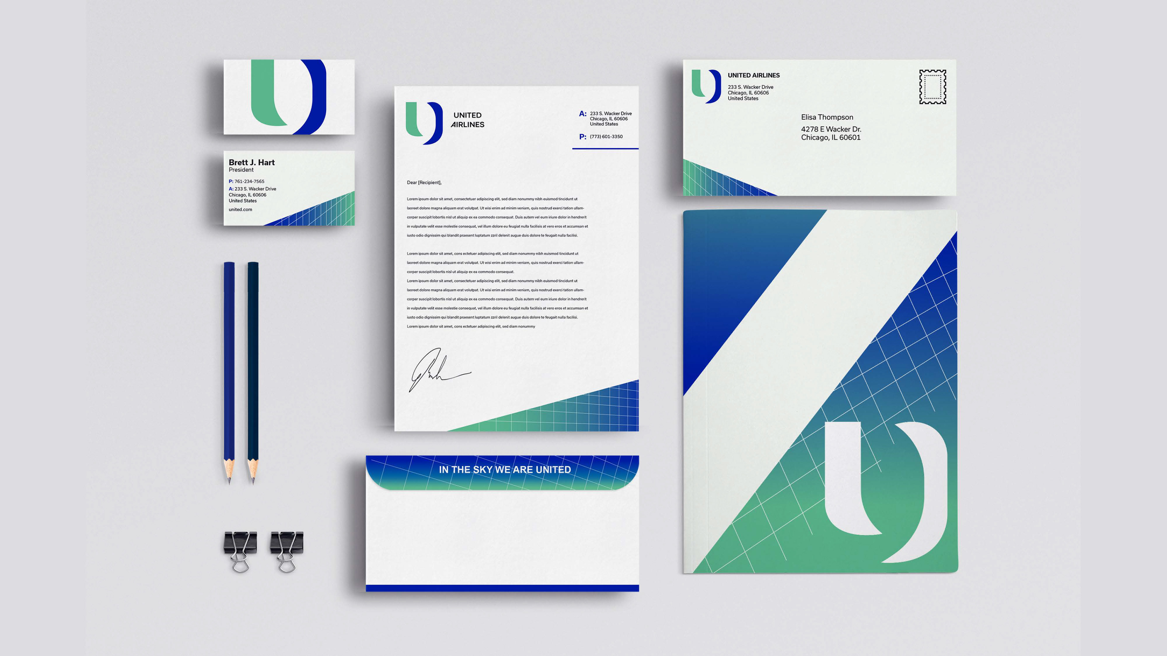
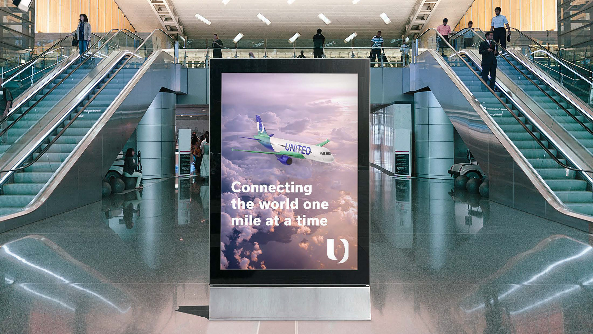
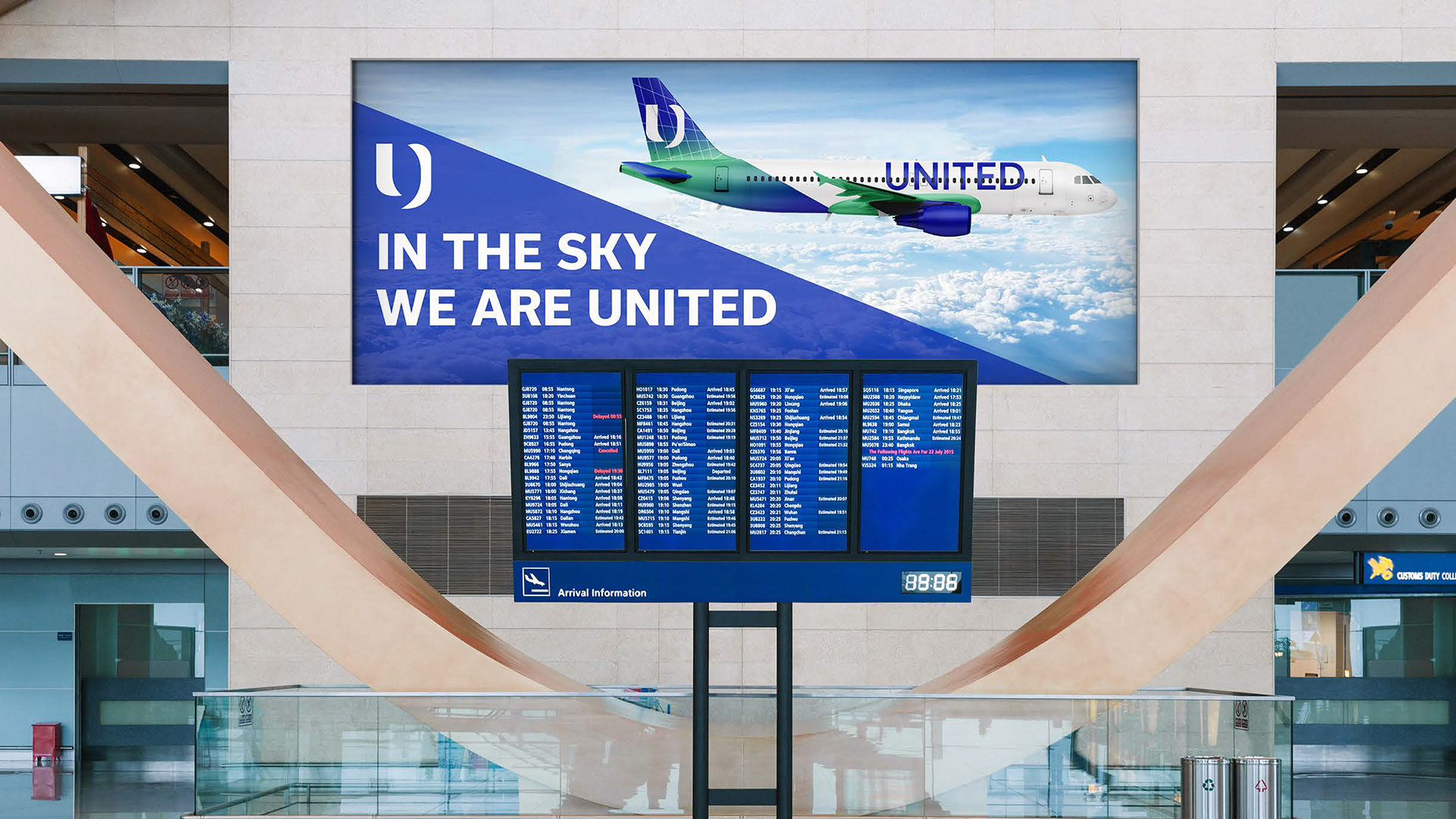
In one of my classes at DePaul University, I was tasked with redesigning a company’s brand identity. I chose United Airlines because I felt their current logo was too literal and lacked originality. I challenged myself to create a more abstract design while maintaining the visibility of the letter "U." My goal was to give United a fresh, modernized look that stands out and reinforces their status as one of the world’s leading airlines.
Below is the full presentation and process of the United Rebrand deck.
